I have a big background image of 1920x550px and I want to place a div directly under it. Since I don't know how to display the full image, I used a dirty trick and actually filled the image with a transparent part so it is a 1920x1080 image, then I display it with this:
.bg-image-big{
    background: url(../images/header-bg-big.png) no-repeat center center fixed;
    background-color: #f7f7f7;
    -webkit-background-size: cover;
    -moz-background-size: cover;
    -o-background-size: cover;
    background-size: cover;
}
This stretches it to be always full screen. Two problems now: That does not work on mobile (cuts the image) and I have no idea how to place the inner div exactly below the "end" of the actual banner. In theory and a 1920x1080 screen it is a 550px margin-top.
<div class="section bg-light-gray bg-image-big">
   <div class="inner">
      <!-- placed right under the end of the banner -->
   </div>
</div>
Any better approach to that (pretty sure there is). Any hint appreciated!
For the matter of it, I am using Bootstrap3 and FullPage.js
//EDIT:
Visualization as per request:
What I want:
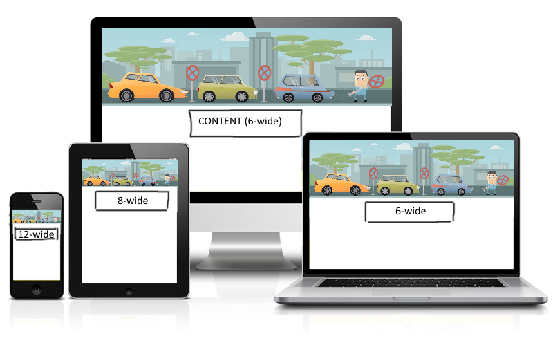
What I have:
Full Desktop

Responsive

This is not about the 6/8/12 wide but about the position of those elements. hope this helps a little more...