The use case for this is a responsive form with radio buttons. When on a big PC screen, all radio buttons normally fit in one line on the screen (like flex items in a non-wrapping flex container with flex-direction: row). On a phone, not all radio buttons normally fit on one line. If any one radio button won't fit, I want them all to display one per line (like flex items in a flex container with flex-direction: column).
This would be easy if I knew how long my radio button labels were going to be, but I don't (they come from a client configurable database).
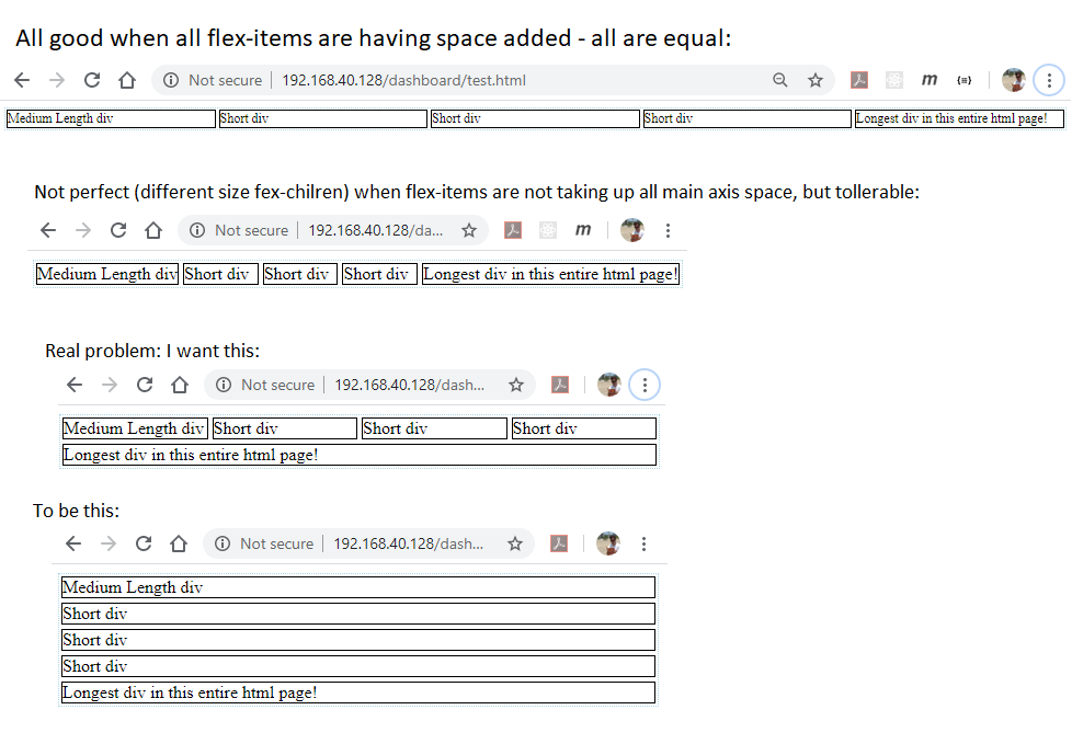
So what I want is like this:
<html>
  <head>
    <title>Responsive Radio Button</title>
    <style type="text/css">
      @media (min-width: 652px) {
        .flexContainer {
          display:flex;
          flex-direction: row;
        }
      }
      @media (max-width: 652px) {
        .flexContainer {
          display:flex;
          flex-direction: column;
        }
      }
      </style>
  </head>
  <body>
    <div class='flexContainer'>
      <div>Medium Length div</div>
      <div>Short div</div>
      <div>Longest div in this entire html page!</div>
      </div>
    </div>
  </body>
</html>
where I don't know before hand what the @media (min-width: /max-width:) breakpoint is.
What I tried
This is my work in progress code
<html>
  <head>
    <title>Responsive Radio Button</title>
    <style type="text/css">
      .flexContainer {
        display: flex;
        flex-wrap: wrap;
        justify-content:stretch;
        /** border so I can see what is going on */
        border: 1px dotted lightblue;
      }
      .flexItem {
        /** white-space and min-width stop text wrapping */
        white-space: nowrap;
        min-width: max-content;
        /** next three lines could be shortened to flex: 1 0 0px; (grow shrink basis) */
        flex-basis: 0;
        flex-grow: 1;
        flex-shrink: 0;
        /** border and margin so I can see what is going on */
        border: 1px solid black;
        margin: 2px;
      }
      </style>
  </head>
  <body>
    <div class='flexContainer'>
      <div class='flexItem'>Medium Length div</div>
      <div class='flexItem'>Short div</div>
      <div class='flexItem'>Short div</div>
      <div class='flexItem'>Short div</div>
      <div class='flexItem'>Longest div in this entire html page!</div>
      </div>
    </div>
  </body>
</html>
flex: 1 0 0 This is used to make all flex items equal in main axis size. But when the wrapping kicks in, the equality of main axis size drops off. If the flex-items all remained the same size, they would all be too long for the parent flex-container at the same time, so would all wrap. This does NOT happen, though, as the minimum size of each flex-item is different, so although the flex items never shrink, they all start growing to fill the left over space from starting from a different size.
It's like I want a flex-basis: largest-sibling, by which I mean the smallest flex-item would start at the same size as the largest flex item, and never get smaller than that largest flex-item.


